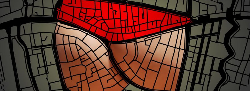
Four views on Leiden
Jos Agasi's visualisation of the characteristic shape of the Leiden city centre gave surprising results.
In 2008 the exhibition 'U bevindt zich hier' (You are here) took place in the RAP Architecture Centre in Leiden. Artists, architects, designers and contestants gave their view on the city in more than 80 town plans and different works of art. In this scope, graphic designer Jos Agasi, one of the initiators of this project, designed four different plans of Leiden. The visualisation of the characteristic shape of the Leiden city centre gave surprising results. The plans of Leiden were acquired for the University Library.
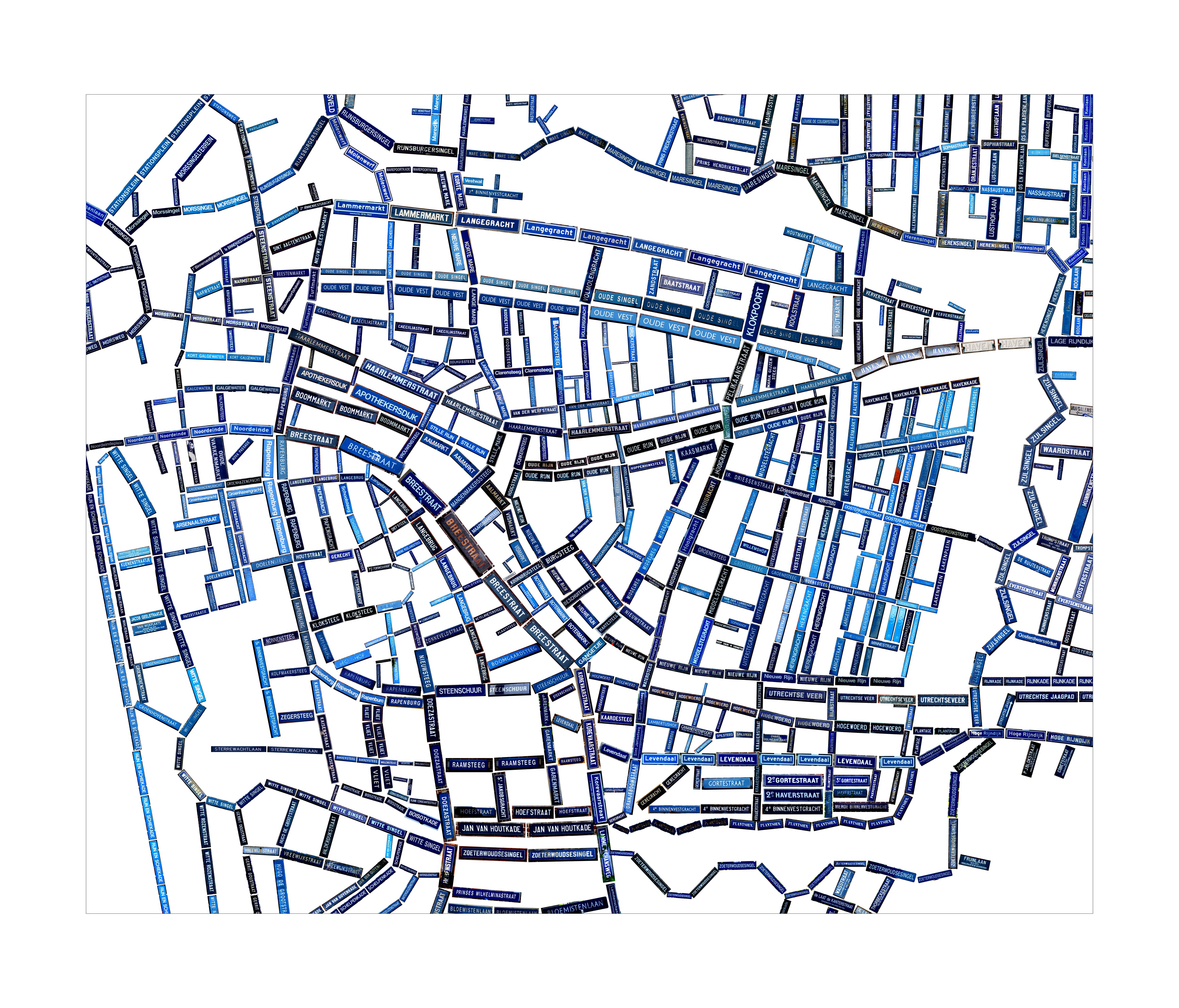
In Leids Blauw (Leiden Blue) photos of all the street signs in the city centre are taken. The street signs form the street plan, at which the signs are placed on the location where they are really situated as much as possible. It is striking how diverse the design and typography of the street signs are.
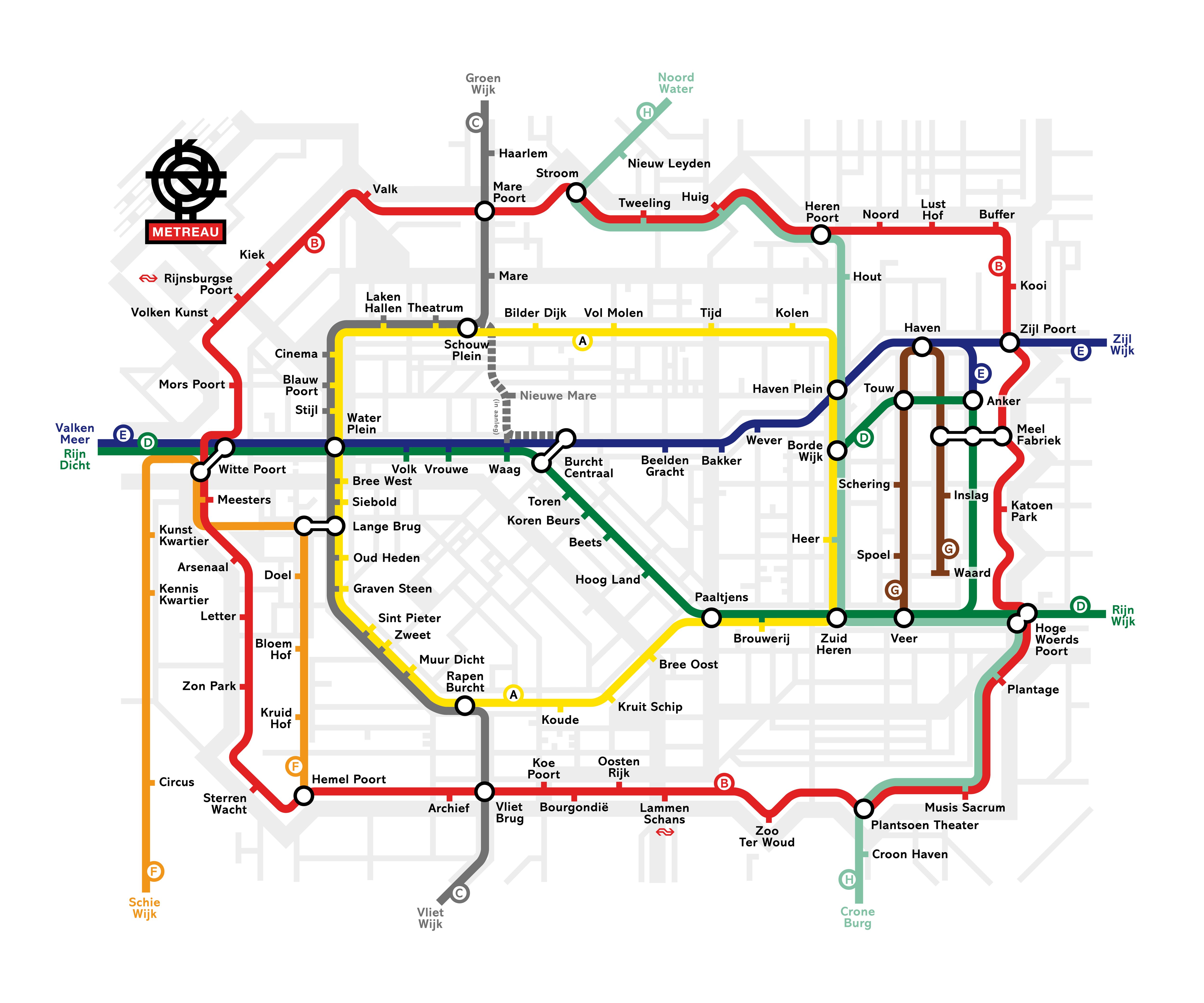
The Metreau map gives an alternative, environment-friendly public transport plan for the city centre of Leiden, using the canals. The logo of Metreau, in the left top corner of the map, is a strongly stylised canal plan of Leiden. Note the original names given to the stops. The design of this map is based on the famous London Underground map of Harry Beck, first published in 1931. Beck's design, in which exclusively horizontal, vertical and diagonal lines are used, shows notable similarities with the principles of De Stijl.
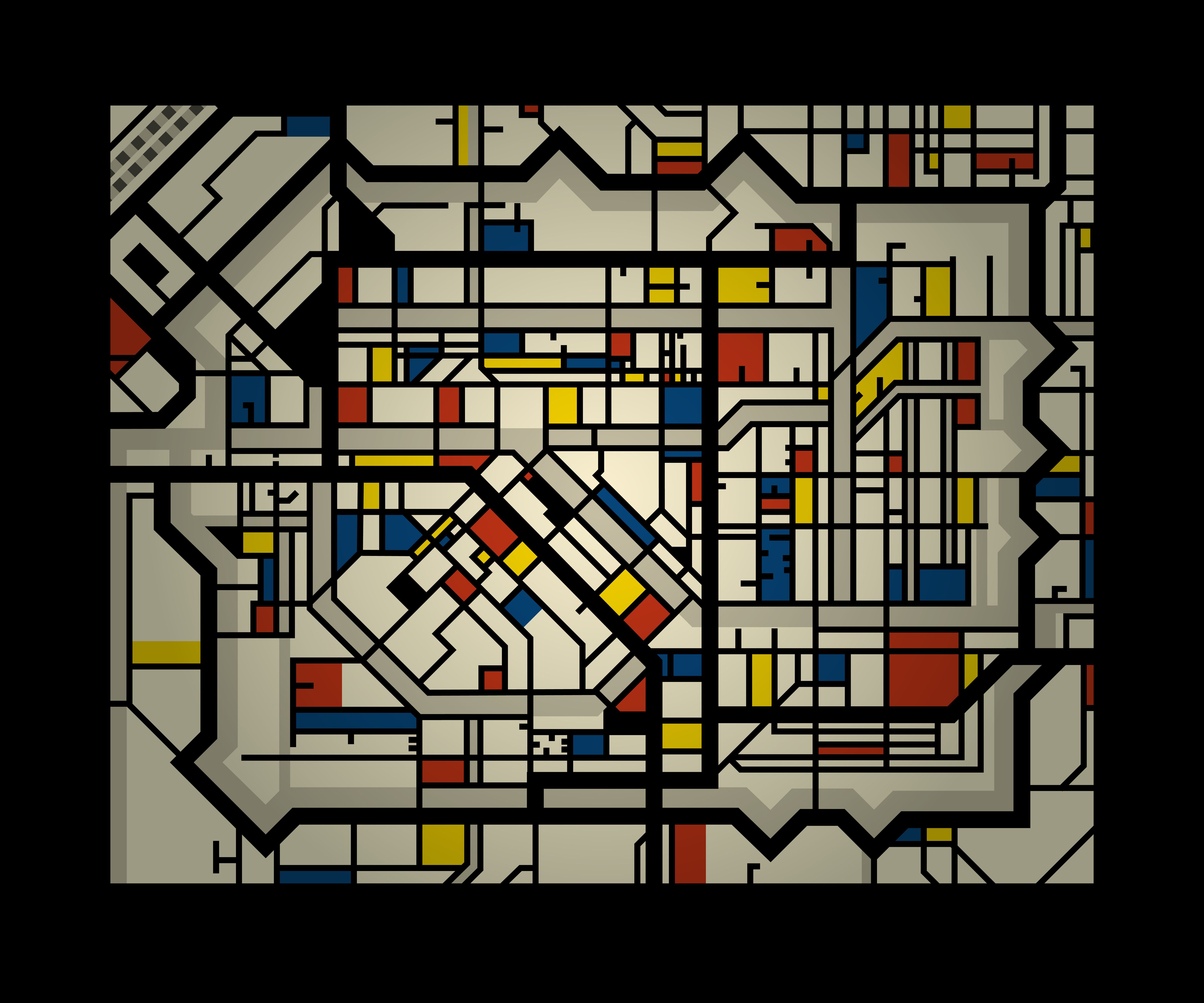
Probably, De Stijl Kaart (De Stijl Map) appeals most to the imagination. Here, Agasi is inspired by the work of Theo van Doesburg, who lived in Leiden a few years. The artistic movement De Stijl ('The Style') was founded by Van Doesburg in 1917 in Leiden and advocated a reduction to foundation and the essence of reality. The exclusive use of primary colours (yellow, red and blue) and black, grey and white and of horizontal, vertical and diagonal lines are characteristic for De Stijl. The Leiden city centre beautifully proved to fit in this straitjacket. This map is meant as a design for a leaded window in the city hall of Leiden.
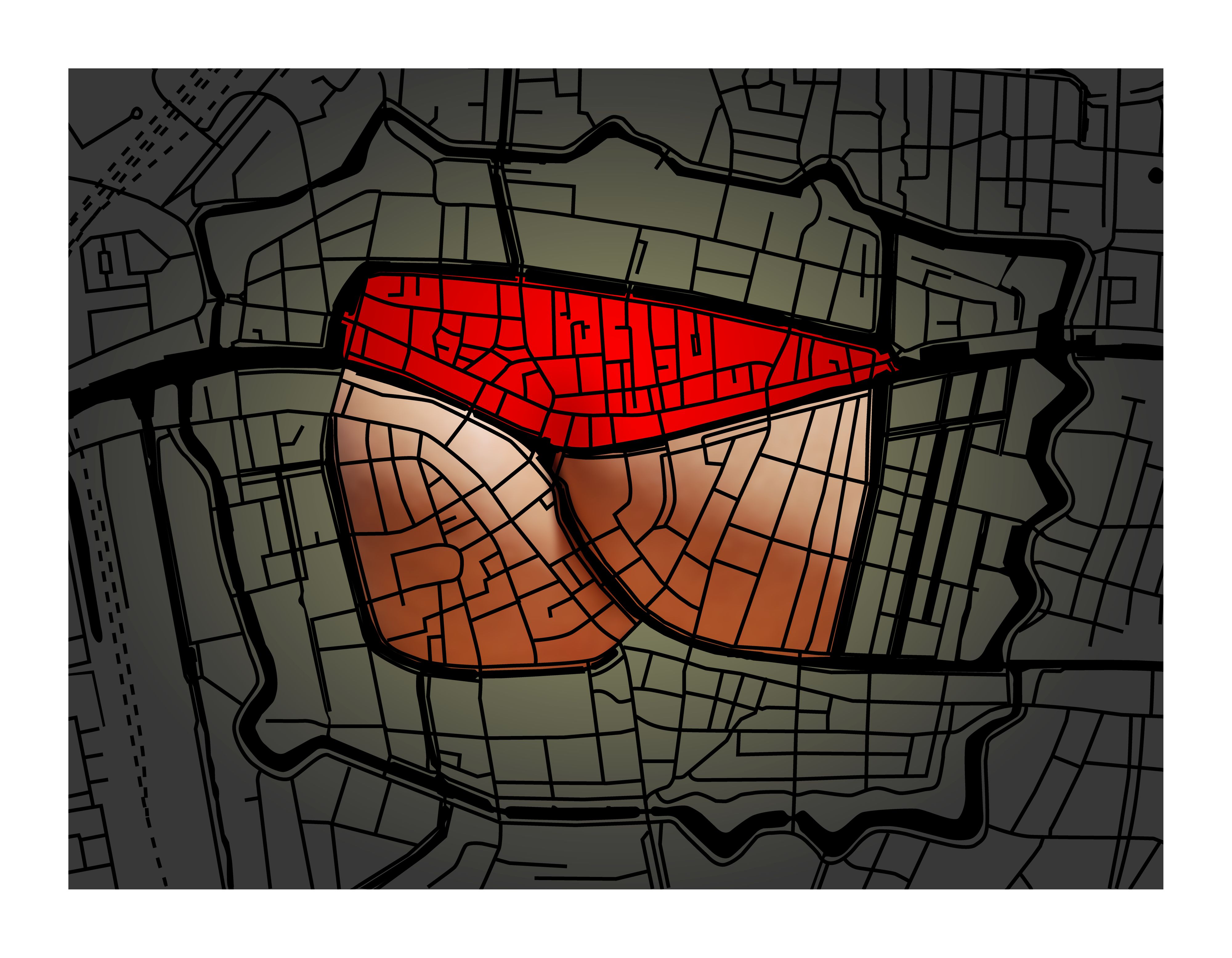
A fourth design is titled Groeten uit Leiden (Greetings from Leiden). Without manipulating the canal and street plan of the city, a quite provocative shape emerges in the oldest part of the centre. 'Leiden by night' would also be a good title for this playful map.


